SafeCorp approached ZURB wishing to envision a mobile first banking experience that transforms the way people manage and interact with their daily finances. Not only will the experience inspire customers to easily understand the brand and its value proposition with a touch of their finger tip; the experience will further surprise and delight them as SafeCorp becomes their primary banking relationship. SafeCorp would like to inspire banking customers into a stress free and healthy financial life.
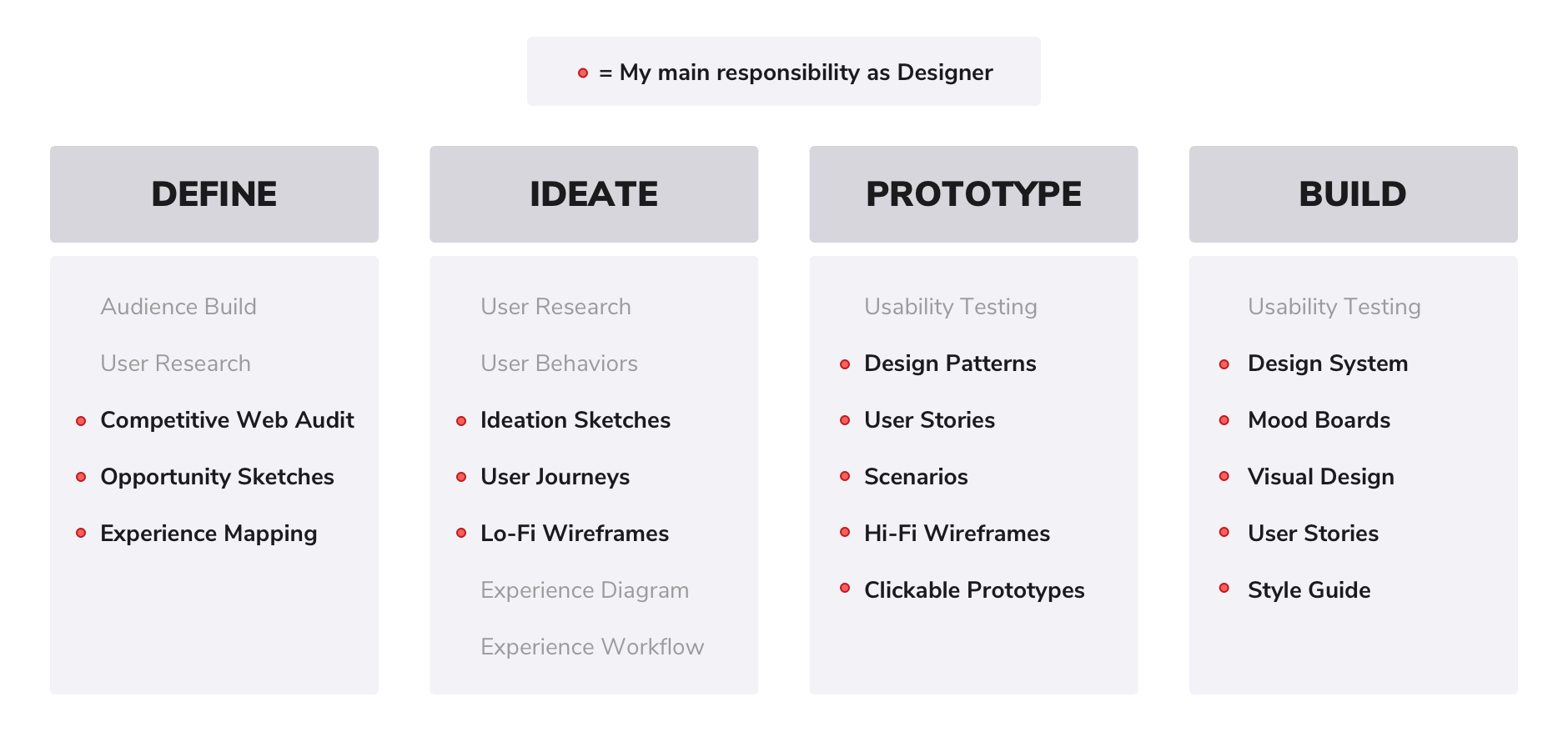
My team and I discovered what's important to users when it comes to organizing their money and staying on top of payments. I created an experience centered around transactions and gives the user an understanding of their spending as they live paycheck to paycheck. I designed an interface experience that is clear and concise, eliminates friction points and creates inspired moments in the financial journey.
My team member and User Researcher built 4 audiences to give me a unique look at how people in our audiences think about their finances. The audiences focus specifically on middle class earners with prime credit, earning between roughly 44k and 100k a year, seeking banking solutions.
Throughout the project, I constantly collaborated with the User Researcher on what concepts and designs I wanted to test with users.

Financially-struggling Consumers
Low-balance Banking Consumers
Credit Union Members
Large National Bank Members
Credit Card Holders

Financially-responsible Consumers
High-balance Banking Consumers
Credit Union Members
Large National Bank Members
Credit Card Holders
Prime Credit Score Consumers

Remote Consumers
Mobile & Remote Consumers
Multiple Account Holders

Middle Income Consumers
Middle Income Families
Average Credit Score Consumers
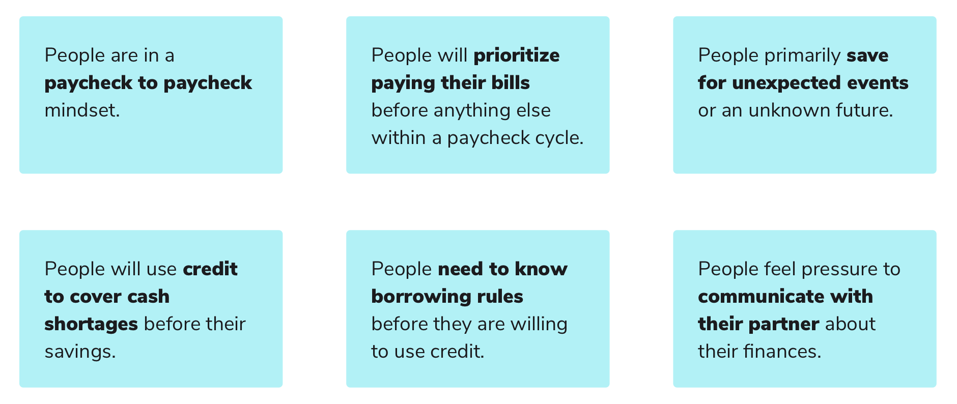
From User Research, my team and I cultivated these Principles based on the audience behaviors we have collected. I used these to drive the interaction decisions in the screens and workflows.
I dove into Opportunity sketches to frame the problem space and open up the project to potential solutions. I presented about 50 sketches to understand our client's perspective of the problem and grasp the client's reaction to potential solutions.

These User Journeys allowed me to understand what draws the user into this app, what are the user's problems, and how does the app specifically help them in a scenario. I created 12 of these that included a problem journey and a solution journey.
These Ideation Sketches allowed me to move forward from the Opportunities into visualizing simple UI components in sketch form as to not get too caught up in details and draw the focus towards concept and experience.
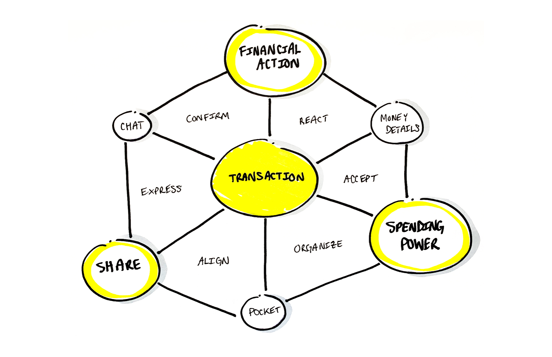
My Design Team Lead and I created an Experience Diagram that captures the high level concepts in the system that emerged from our Principles. It shows the key actions a user will consider in the first few taps.
The goal is to create sticky behaviors that get people coming back to interact with the mobile app.
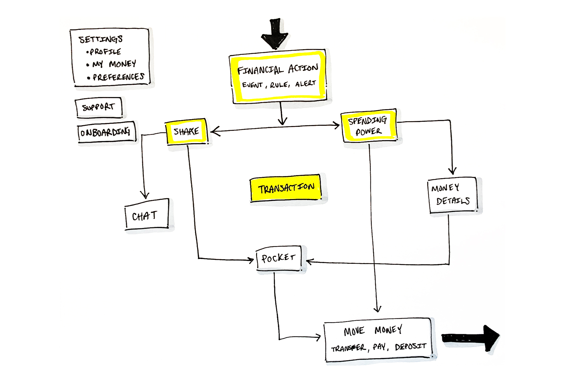
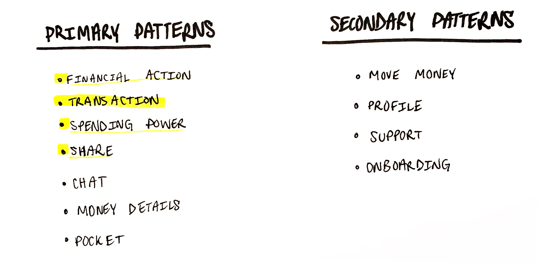
I created this workflow diagram to understand how a user enters into the app and what function leads to the next. This also displays the primary and secondary patterns of the design system.
To land on these Hi-Fi Wireframes, I iterated through over 150 user flows of tasks that could happen in the app and what would be the best interactions ultilizing the Design Patterns.
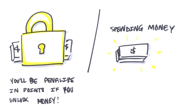
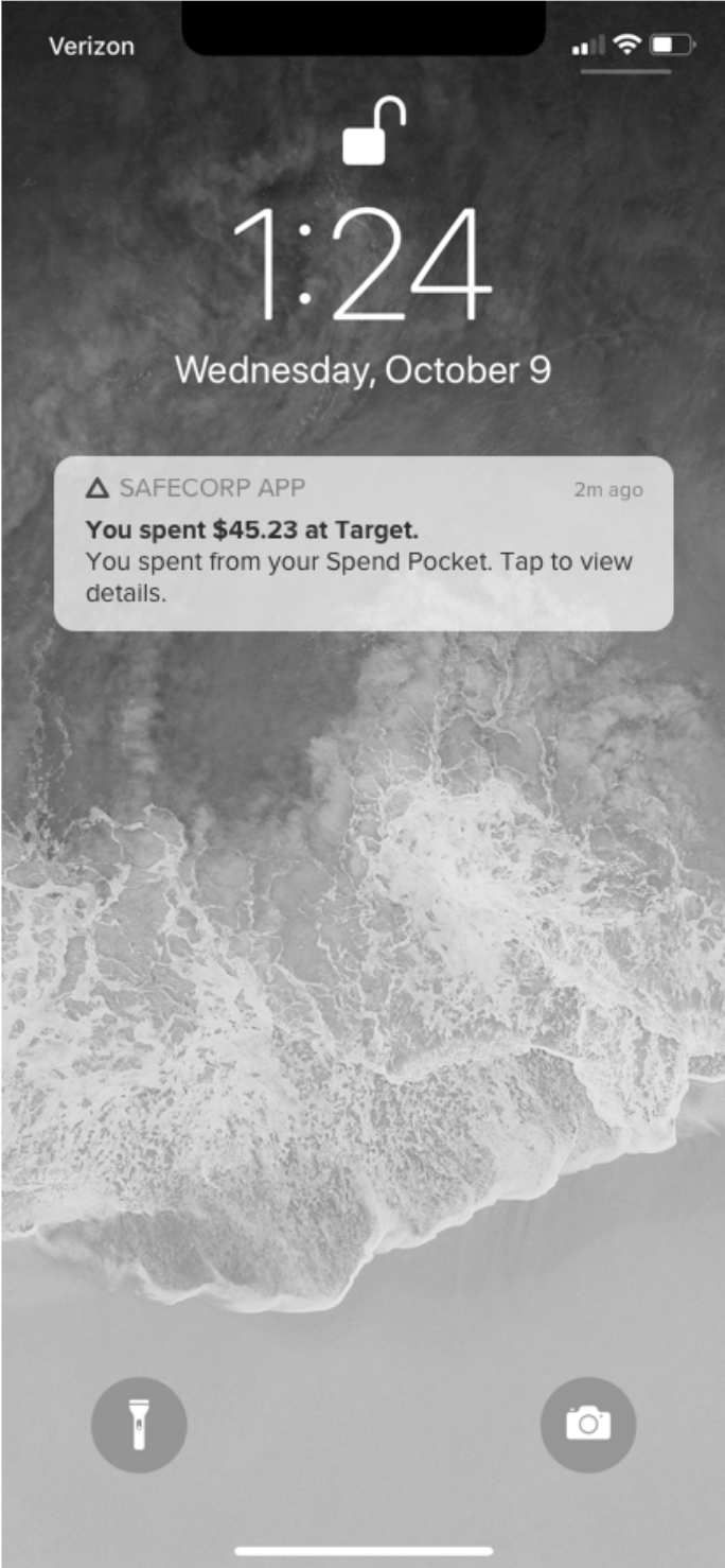
Alerts create awareness of a Financial Action in the app. The Financial Action creates an event, can be triggered by a rule, and pushes an alert to a user in the system. The financial action is first part of a financial behavior that enables us to create trust with a user.
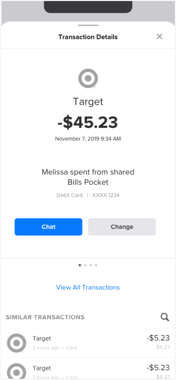
Transactions are the foundation of our system. We can use them to spark new ways for users to feel better about their financial health. Transactions manifest as screens in the system, but they also reveal themselves in more specific ways throughout the app experience.
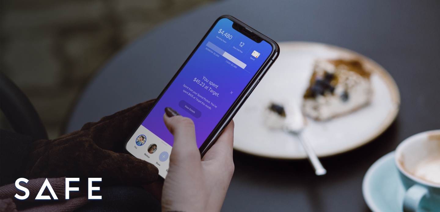
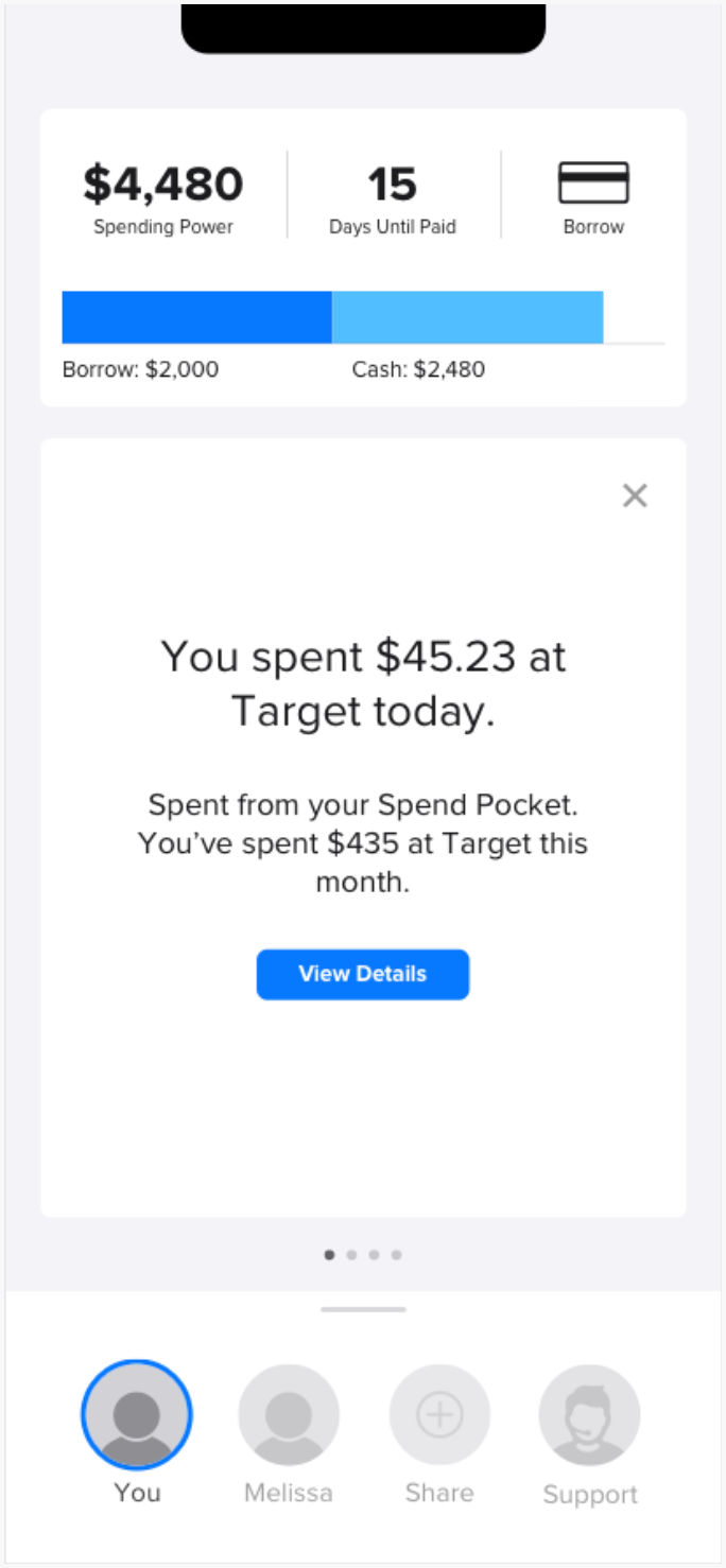
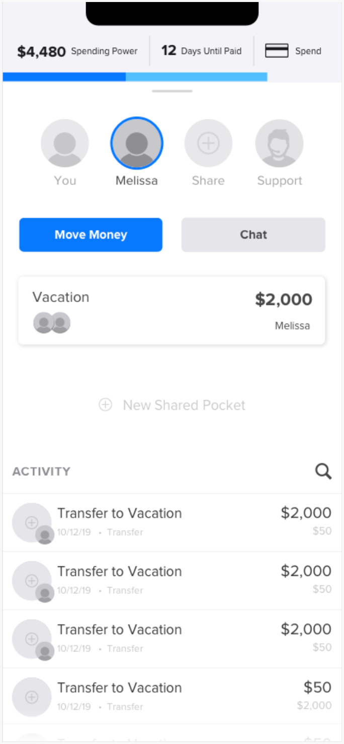
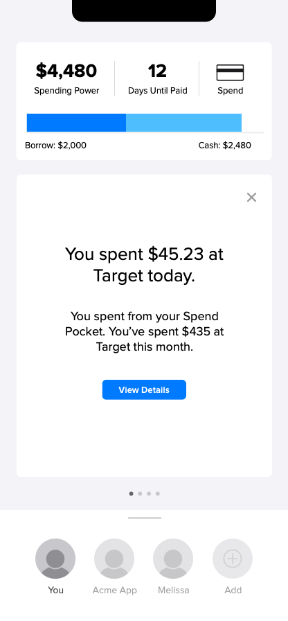
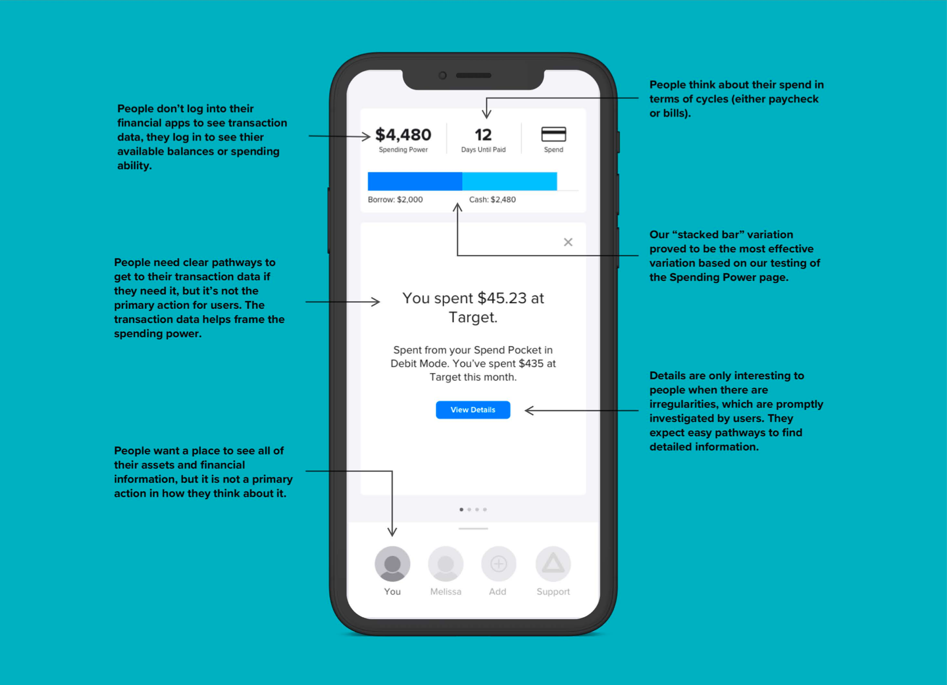
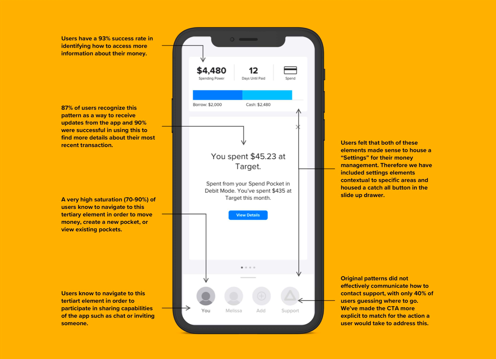
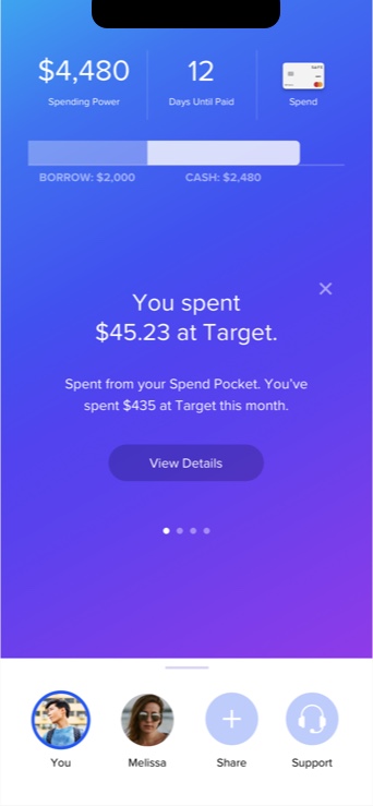
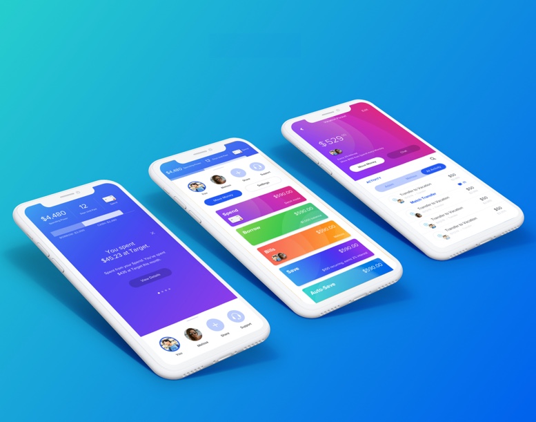
The Spending Power screen gives users a unique view of where a user is in their spending over the course of a paycheck or billing cycle. It’s the main screen people will see when they come into the system. This screen answers key questions for a user:
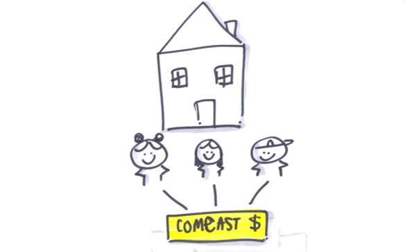
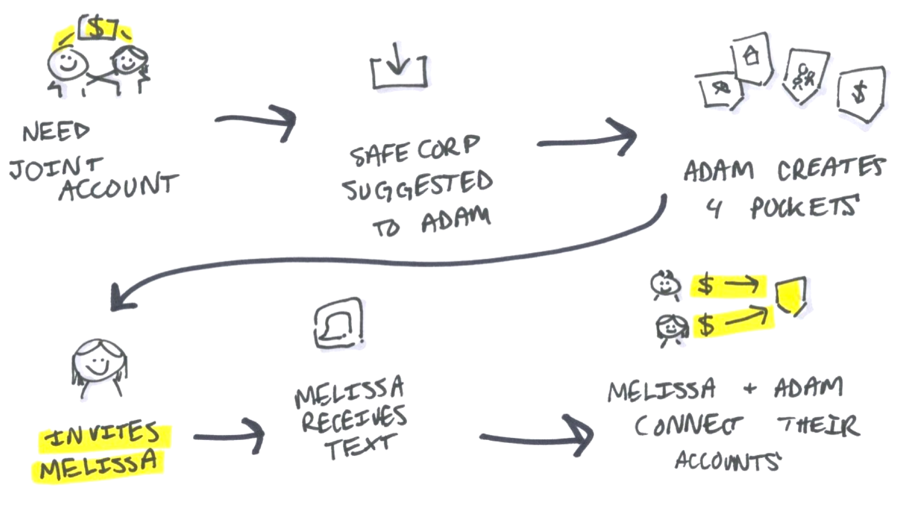
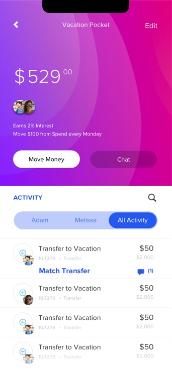
A key part of the user experience is integrating a partner into pocket management. The Share screen is accessible on the Spending Power screen and makes it easy to manage money with a partner.
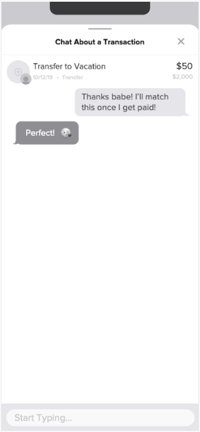
After a user selects a partner, they can chat directly with them about a pocket or specific transaction. In the case of a transaction, it remains visible so each person can chat with financial context.
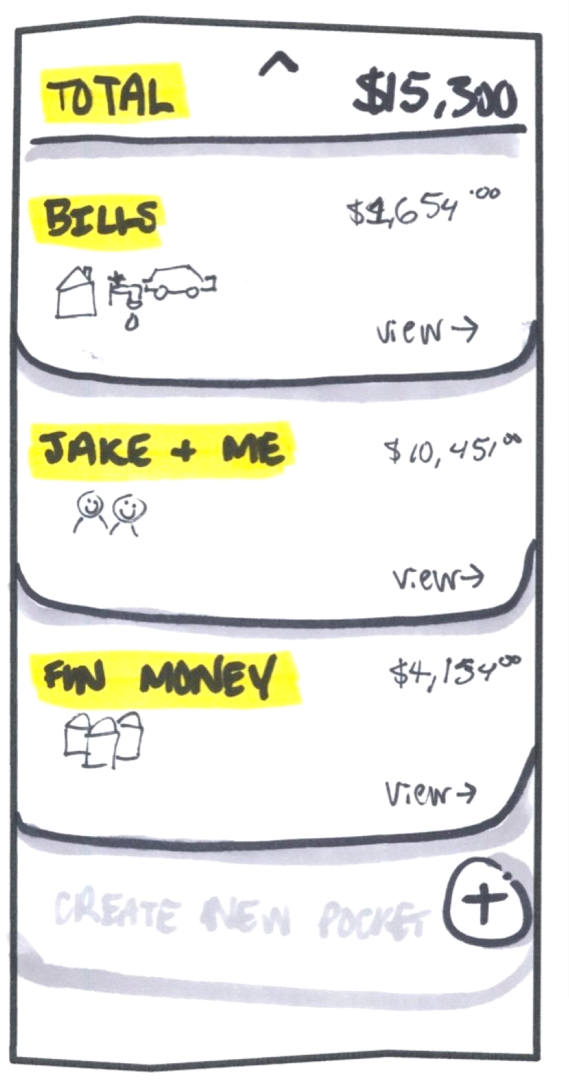
When a user clicks on their Spending Power graph, they get a detailed view of their total assets and a breakdown of their money across different accounts.
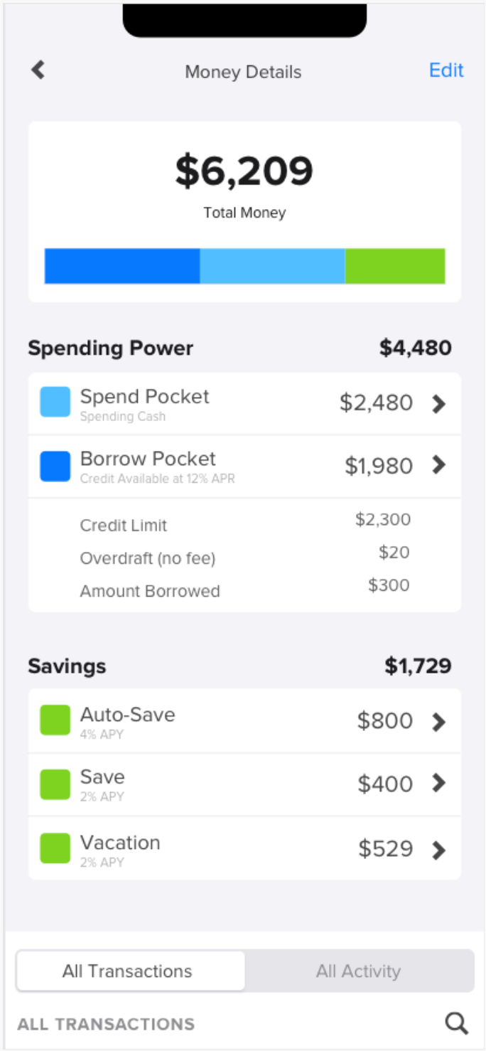
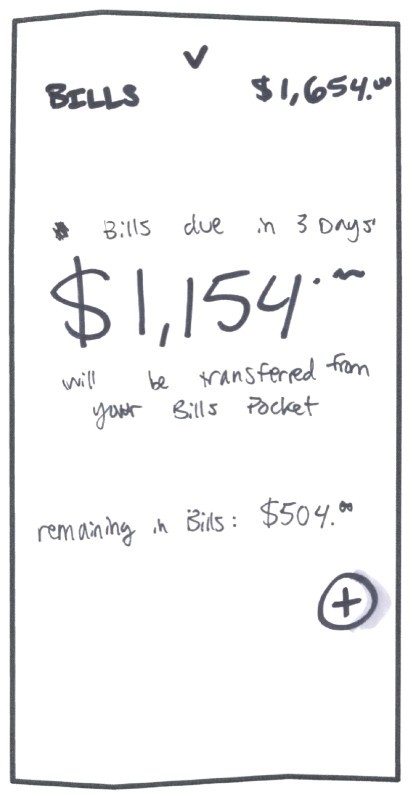
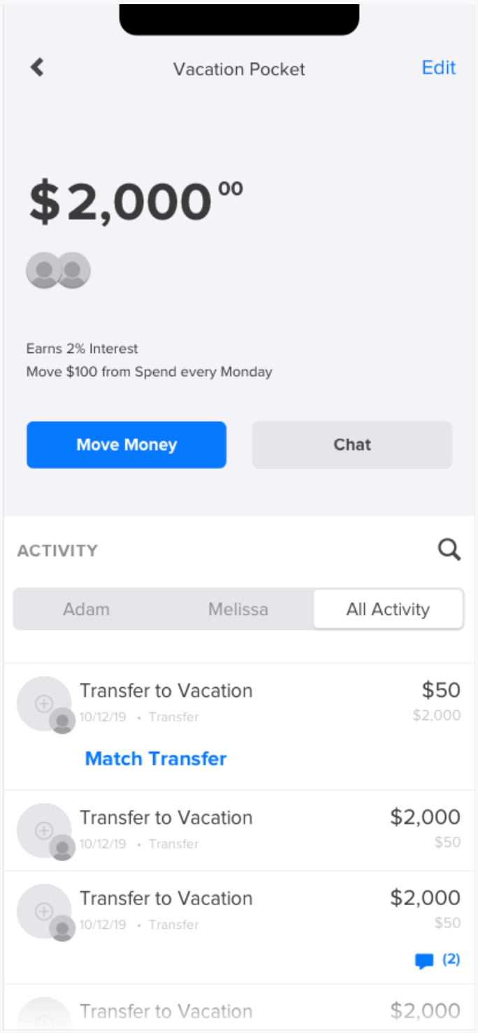
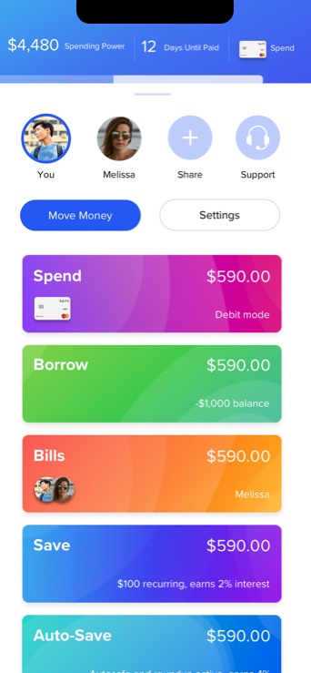
Pockets enable users to organize and spend their money in ways that give them more control than a typical savings or checking account.
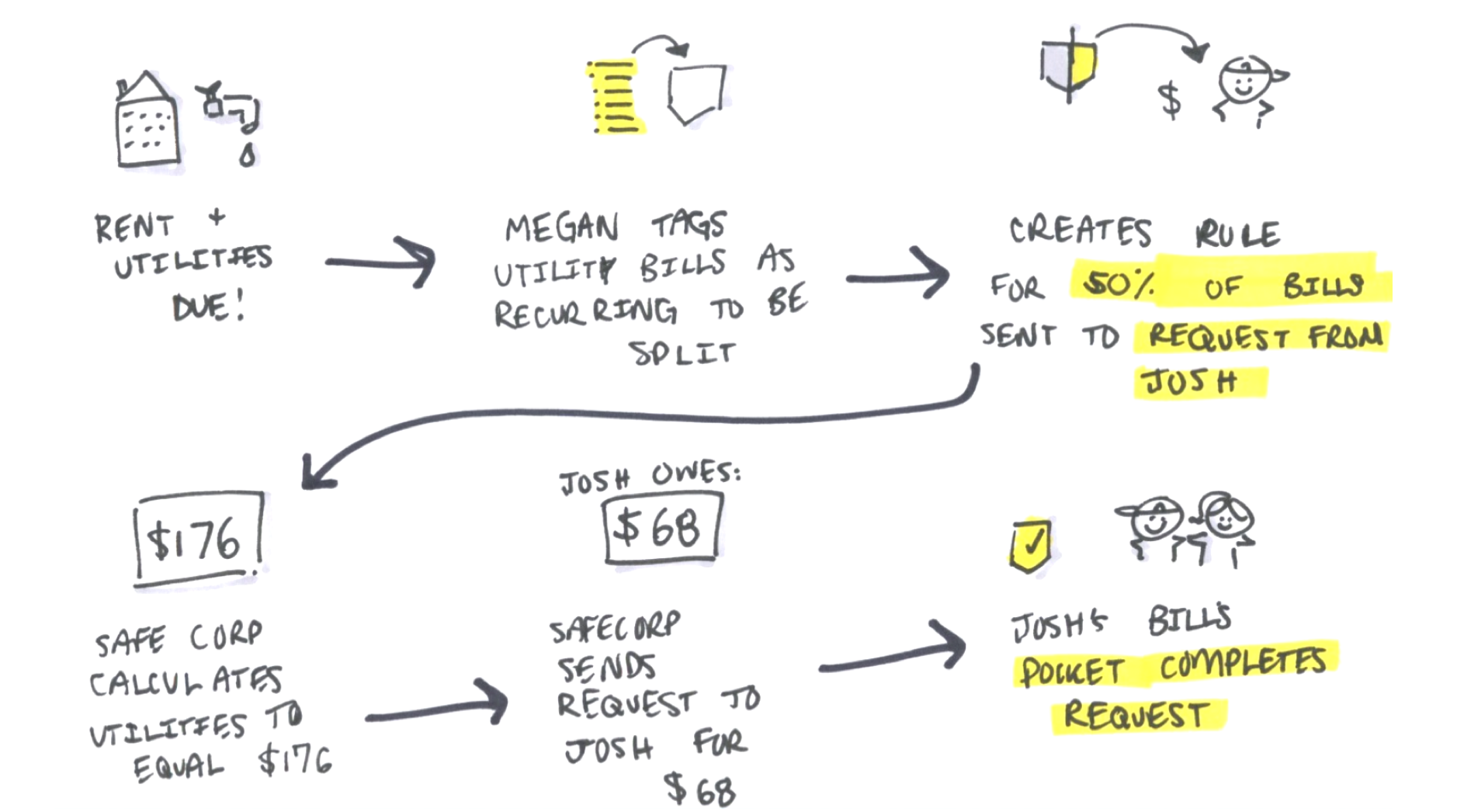
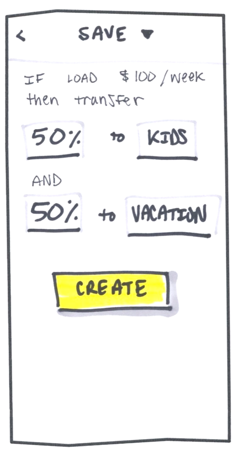
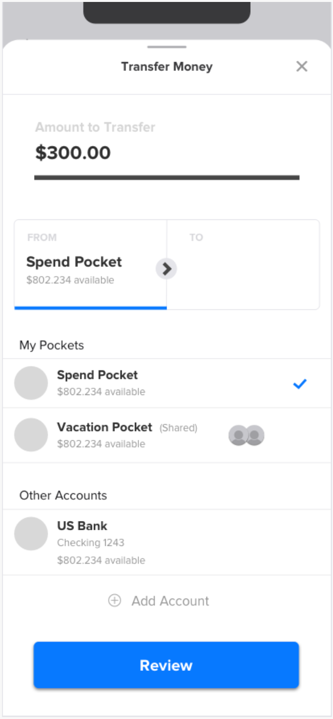
Move Money is a universal pattern that can be accessed from different places within the app experience. The Move Money module enables users to transfer money from entities and pockets. Specifically, users can transfer, pay someone, deposit checks, and add direct deposit.
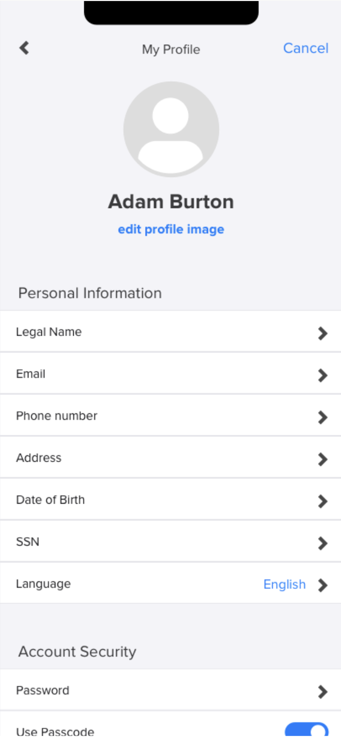
The Profile screen includes a number of traditional banking settings, as well as concepts specific to SafeCorp. The profile includes your money card, your personal information, notification preferences, permissions to login, recurring transactions (rules for your money in and out) and general support.
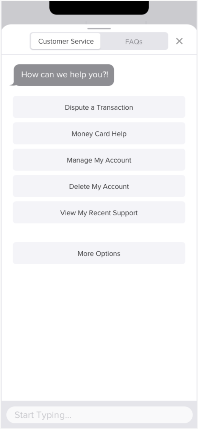
Support exists in two formats- a direct response from agents in a messaging system (that can be accessed in the tray and profile) and an FAQ that enables users to get to answers on their own.
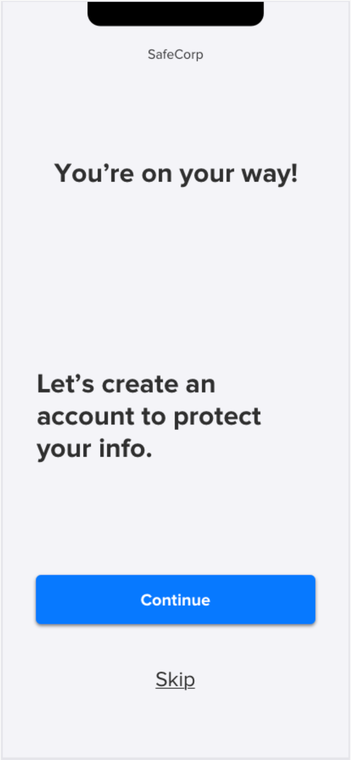
Onboarding is a system comprised of over 200 screens states across various stages of the app experience. These screens overlap with the zero state screens and activation concepts.
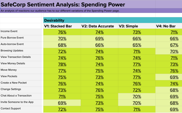
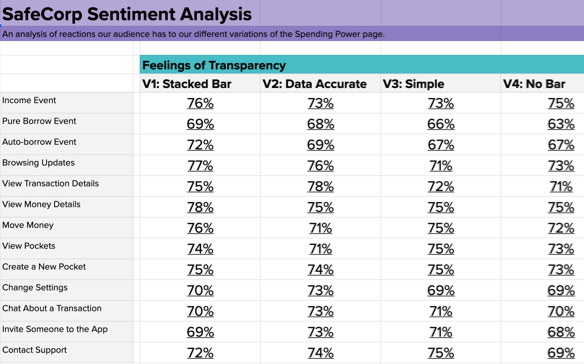
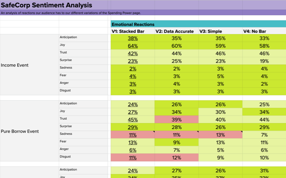
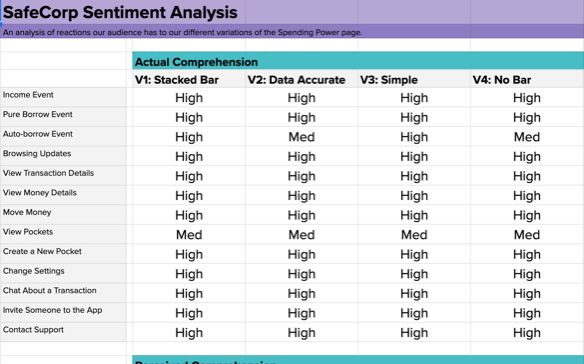
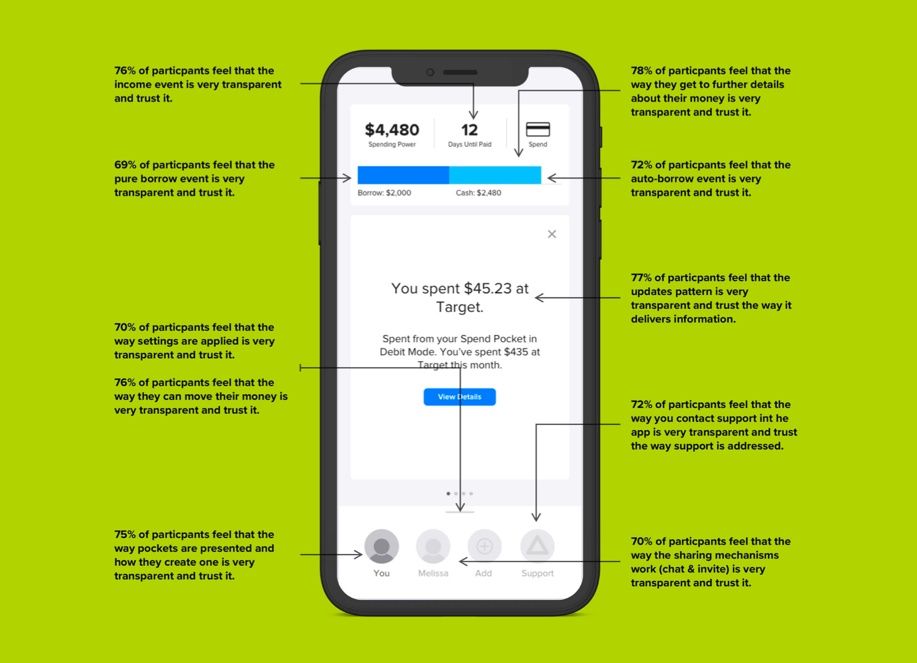
I created 13 different user flows from the app and across 4 different types of spending power bar variations for a total of 52 animtions created in Principle. My team member and User Researcher tested these animations with users to understand which variation of the spending power bar we should move forward with.

Below are the user survey results across different emotional guages. The screens marked in red, I redesigned and tested again to show improvement in interaction and comprehension.
I strung together all of the Hi-Fi Wireframes into a clickable prototype created in Marvel. This showed the team the various flows and how the design patterns above interact together.
The User Researcher on my team ran over 2,000 user surveys to test the interactions of our app concepts with our 4 Banking audiences. This allowed me to iterate on the Hi-Fi Wireframes based on the user survey data and lastly validate my design decisions.
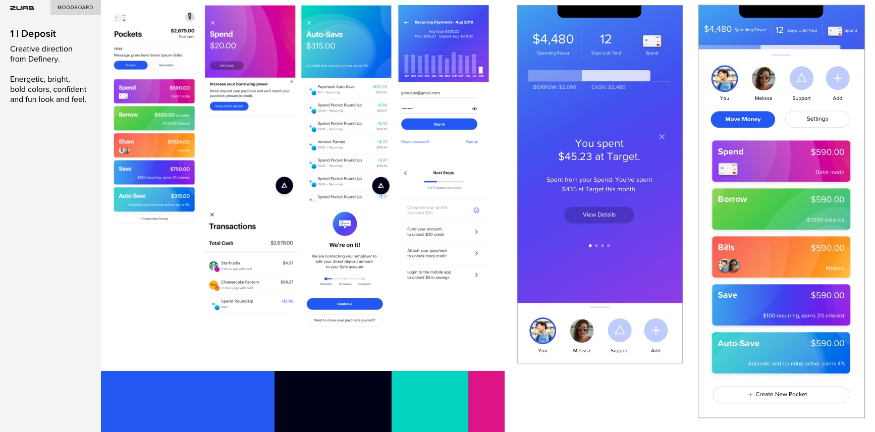
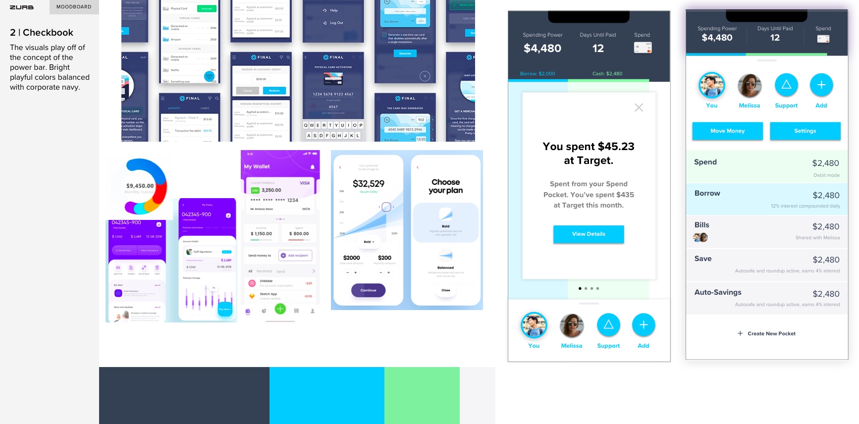
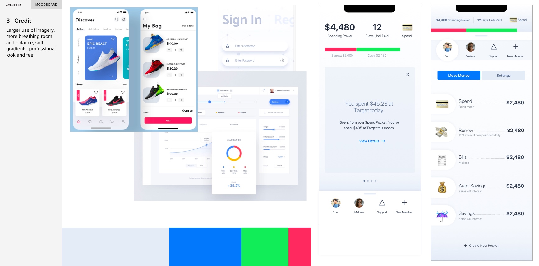
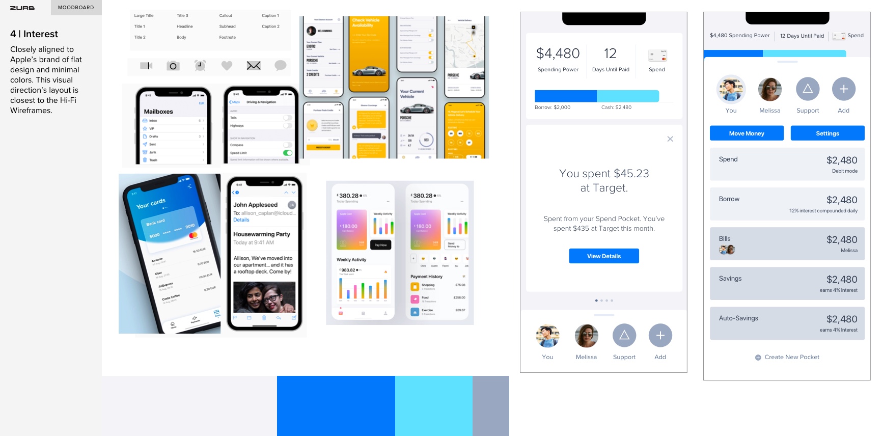
SafeCorp wanted visuals that were modern, clean, simplistic, bright and bold. They needed something that they could easily market to their audiences. I explored 4 directions of visual design expressed in Mood Boards and applied visuals to a few screens of the system.
Through this project, I accomplished these following goals:
Designed an interface experience that is clear and concise, eliminates friction points and created inspired moments in the financial journey. My team and I tested this continuously through our engagement with the SafeCorp target audience. I produced an iterative plan that shows how testing, copy, design, and development will help the team achieve success, as well as built an amazing new brand.
Ensured the banking app experience is easy to use, taking into consideration the latest design trends for key interactions and behaviors. The app establishes trust by collecting information such as personal income, and creates stronger engagement and simplify the banking experience.
Created a progressive, fresh design that encourages continued engagement with SafeCorp for banking, as well as portrayed the high level of trust for their customers. The experience and story is mobile first and told in small stories that make up a larger story. I included the interactions of flick, swipe, and Tap.
Delivered high fidelity implementation ready designs for entire flows as Sketch files uploaded into SafeCorps invision workspace, and animations and other documents shared on Google Drive and handed-off deliverables ready to use for engineers and other designers.
